Your Logo Looks Sharp on a Phone. Is It Sharp Enough for a Printed Label?

The logo looks clean in a chat message, so it feels ready for printing. Then the label sample arrives with soft edges around the brand mark. Before asking the printer to sharpen it, I would check what the file actually contains. A screenshot wrapped inside a PDF is still a screenshot.
File extensions make this conversation unnecessarily confusing. “PDF,” “SVG” and “high resolution” can sound like guarantees, although the artwork inside may contain a mixture of objects. The useful purchasing question is whether each element has enough information for the size at which it will be printed.
Understand what can and cannot scale cleanly
A raster image is made from pixels. Vector artwork describes shapes using paths. Adobe's explanation of raster and vector files distinguishes these approaches and their different behavior when scaled. For a simple logo, a well-prepared vector original can avoid the pixel limitation of a small screenshot.
That does not make every vector-labelled file production-ready. A document can contain embedded raster images, effects or outlined text with its own problems. Nor does it mean every photograph should be traced into paths. Keep photographic content as an appropriate raster image, and preserve clean vector artwork where it exists.
Ask for the original source rather than repeatedly exporting the same preview. If the only file available came from a messaging app or website thumbnail, tell the designer. The missing detail cannot be recovered simply by changing the name or file extension.
Check pixels at the final printed size
Effective resolution depends on how large a raster image is placed. Divide its pixel dimension by the corresponding printed dimension in inches. This is arithmetic, not a promise that a particular pixel density will meet every printing process or reproduce every fine detail.
For an illustrative calculation, a 300-pixel-wide logo placed one inch wide has 300 pixels per inch. Place that same logo two inches wide and it has 150 pixels per inch. No pixels disappeared from the source; they were spread across more physical space. The supplier should confirm the appropriate artwork requirement for the intended job.
Do the calculation for the actual logo width, not the entire document page. A large file can still include one small, low-detail image. Equally, a modest raster image may be adequate when used at a smaller size. File size in megabytes is not a useful substitute for inspecting the artwork.
Two hypothetical buyers need different fixes
Consider a buyer with an original vector brand mark but only a blurry preview in the purchasing email. The right next step is to obtain the original artwork from the designer. Redrawing it from the preview would create unnecessary work and could introduce small differences from the approved brand.
Now consider a buyer whose logo was created as a small raster image and has never existed as vector artwork. The designer may need to rebuild the mark or simplify fine details for the intended label. That is a design task requiring review, not a one-click conversion that should be accepted unseen.
A photograph presents a third situation. Replacing it with a vector outline would change the design rather than solve the source-image problem. Ask for the best available photographic original and review its crop and placement. The useful fix depends on what the element is supposed to communicate.
Readability is bigger than resolution
A mathematically sufficient image can still make a poor small label. Fine strokes, tight spaces, low contrast and a busy reflective background can reduce clarity at the actual size. Inspect the mark as part of the whole information hierarchy, not as an enlarged icon floating on a screen.
If the source is already suitable but small lettering remains difficult, compare positive and reverse text at final size before requesting another higher-resolution export. That review examines letter openings, spacing and an alternative information panel.
Use the holographic label readability guide when deciding which parts should sit on an opaque area. A crisp brand mark is easier to evaluate when a rainbow reflection does not cut across every edge. Keep the product name and essential information prominent as well.
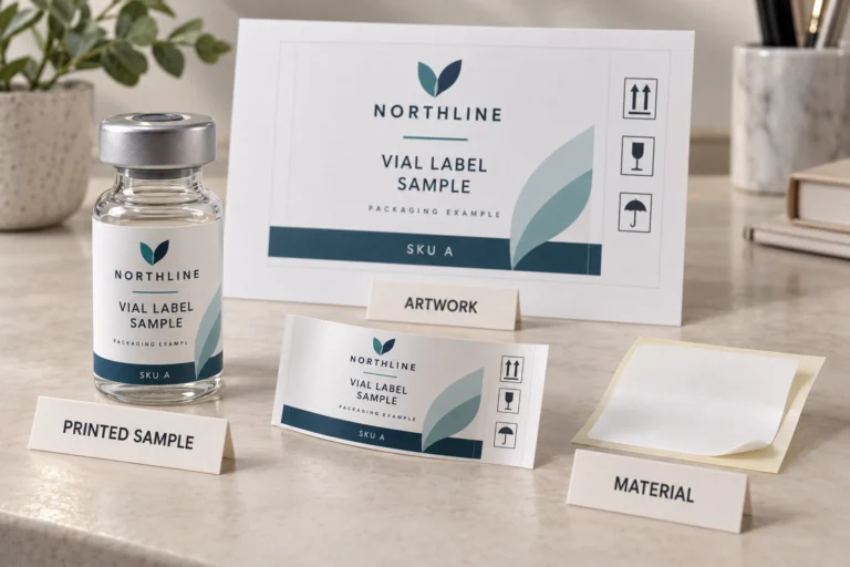
Review a physical, actual-size sample when fine detail matters. Zooming in is useful for finding defects, but it cannot replace looking at the size the customer will hold. Conversely, a tiny screen thumbnail can conceal a poor source file. Both exaggerated enlargement and casual phone viewing can give a misleading impression.
Send a useful artwork package
The purchasing team does not need to become a design studio. It does need to keep source artwork, preview files and approved revisions organized. Describe the intended size and what each file represents so the supplier does not mistake a reference picture for the final print asset.
- Send the original vector logo if available, plus a visible preview for reference.
- Provide the best original raster images, rather than screenshots or repeatedly compressed copies.
- State the intended printed dimensions and which elements must retain precise brand proportions.
- Identify required wording, fonts or brand guidelines and ask the supplier how to supply them appropriately.
- Review any redrawn or simplified mark as a new artwork revision before production.
Do not discard your editable original after a print export is approved. Later size changes or additional SKUs may require changes that are easier and safer in the source document. Keep the approved output alongside the source and a clear revision reference.
Use the first draft to start the discussion
The free label designer can help explore wording, colors and a starting layout. Its preview is an initial concept, not a guarantee that an uploaded source logo contains sufficient detail. Download the concept and tell the design team which parts need refinement.
Request free artwork help from RP Labels with the original logo, intended label size and quantity per design. If the only available asset is a small image, say so directly. The productive conversation is about rebuilding or obtaining the right artwork before printing, rather than applying more sharpening to an already damaged screenshot.
Frequently asked questions
Does saving a logo as PDF make it vector artwork?
No. A PDF can contain raster images as well as vector objects. The artwork inside the file determines how the logo behaves when enlarged, not the extension alone.
Is a larger file always better for label printing?
No. A large file may contain unnecessary content or a low-detail embedded image. Check the relevant source artwork and its intended printed size, then confirm the supplier's requirements.
Can the designer recreate a low-resolution logo?
It may be possible, depending on the design and available reference. Treat the recreation as artwork requiring approval. Automated tracing can change fine shapes and should not be accepted without inspection.
Should I assess the logo on screen or on a printed sample?
Use screen inspection to review files and artwork, then examine a representative actual-size print where detail is important. Consider contrast, material and the finished container alongside image resolution.