Small Vial Label Text: When to Change Reverse Type Before Printing
Sharp artwork can still contain difficult small text
The white lettering looks crisp when the designer enlarges the PDF. At the finished vial-label size, the same line is harder to read. Asking for a higher-resolution export may miss the problem: the file can have clean edges while the letter shapes, spacing and background leave too little room for a useful printed result.
I would compare the actual-size reading task before changing the whole design. Identify the words that must be read, inspect their small internal spaces and compare a restrained heavier reverse version with a positive-text alternative. Then ask the printer to review the candidate against the proposed production construction.
This is an artwork approval method. It supplies no universal minimum point size, no regulatory text requirement and no claim that every white-on-dark design should be removed.
Separate polarity from source quality
Positive text places the printed characters against a lighter or unprinted-looking background. Reverse text creates light-looking characters within a darker printed area. The exact physical construction still needs clarification: light-looking text might expose a base material or involve a separate printed layer, depending on the job.
The source-resolution guide explains whether the artwork contains enough detail at its placed size. That is the first question when the source is a screenshot or a poor raster image. If the source is already suitable, repeatedly increasing the export resolution will not widen a narrow letter opening or create more space between characters.
SixB Labels’ artwork guidelines distinguish positive and reverse type requirements, including differences between font families. Great Little Box Company’s label guidelines also specify different relief and reverse-type requirements for its work. These are those suppliers’ instructions, not RP Labels’ limits. Their useful lesson is that a point-size number without the letterform and production context is incomplete.
Make the words and their reading conditions explicit
List the exact approved text that matters to this review. Identify the product name, variant identifier or other field rather than saying all the small print is unclear. Keep required wording under the appropriate owner’s control; a designer should not delete information merely to make the panel more spacious.
Next, state how the label will be inspected: on the actual curved vial, at the intended printed size, with the relevant surface and ordinary viewing conditions. Enlarged proofs remain useful for investigating details, but they answer a different question from reading the package in its finished form.
Also separate persistent difficulty from a particular viewing reflection. A word that disappears only at one glare angle may need a background or surface discussion. A small character opening that remains hard to distinguish in several sensible views may justify a typography change. Avoid declaring one cause before checking both.
Compare a small set of purposeful alternatives
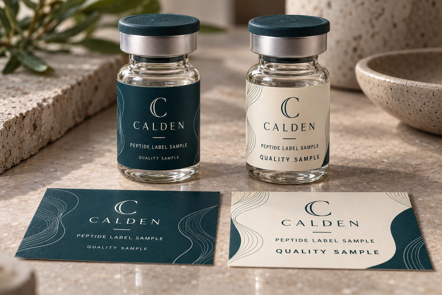
The two example panels make polarity, weight and spacing visible. They are design demonstrations, not calibrated physical proofs; the preferred candidate still needs review against the actual words, dimensions and production proposal.
| Candidate | What it changes | What the reviewer should observe |
|---|---|---|
| Current reverse version | Retains the submitted design | Which exact characters or spaces are difficult at final size? |
| Revised reverse version | Adjusts relevant weight, size or spacing | Do the important openings and word shapes remain distinct? |
| Positive information panel | Changes the text/background arrangement | Is the same approved wording clearer without disrupting hierarchy? |
| Retained accepted reference | Keeps an already suitable production result | Does the proposed change solve a problem the reference actually has? |
Do not change everything at once. If a candidate changes text size, font, background and finish together, it may look different without explaining which adjustment helped. Begin with the specific concern and retain the same approved wording. Record the change so the approver can compare an actual decision rather than pick a favorite picture.
Request the supplier’s job-specific requirements for the relevant positive and reverse elements. Identify the proposed material, output route and any white-print interpretation. The separate overprint and knockout review helps when overlapping objects or white-looking areas are being interpreted differently in output. Typography review should not silently substitute for that technical check.
Use a proof for the question it can answer
An actual-size paper output can expose crowding or an unexpectedly small information area. It does not reproduce every ink, finish, transparent base or curved-container effect. Where reproduction of the fine detail remains important, ask what representative printed evidence is available for the proposed job.
Keep the comparison linked to the final dimensions and revision. If the artwork is resized after review, reassess the affected text. An accepted large preview cannot be used as evidence that the smaller result was examined. The same applies when a newly added language or SKU identifier changes the available panel space.
Record what remains unknown. A designer can approve a preferred hierarchy while the printer is still checking a production limit. Separate those statuses so an attractive option does not become an unexplained instruction to print. If neither candidate meets the required reading task, revisit the layout rather than forcing the existing panel to hold more copy.
Two illustrative layouts lead to different choices
Imagine a small-vial brand using delicate reverse lettering for a secondary identifier. Its comparison shows that a modestly heavier version preserves the brand character and makes the relevant words easier to distinguish. The buyer can ask the printer to review that version, without abandoning the dark panel or changing every text field.
Now imagine a version with much more approved wording in the same area. Making every letter heavier may consume already limited space. A positive information panel or a revised hierarchy could be the better candidate, subject to the actual package and required content. The solution is not necessarily a more expensive finish or a larger vial.
These are illustrative artwork decisions, not print tests. A counterexample also matters: an existing reverse design already has suitable representative evidence and satisfies the intended reading task. Redesigning it simply because another printer publishes a different minimum number would not be a useful purchasing improvement.
Questions about reverse text on vial labels
Can vector artwork guarantee readable small type?
No. Vector objects avoid a particular pixel limitation, but their letterform, spacing, printed size, contrast and production context still matter. Inspect the actual task rather than treating a file type as approval.
Should every reversed word become bold?
No automatic correction works for every layout. Compare the specific field and observe its internal spaces and word shapes. A positive panel or revised hierarchy may be more useful than making all lettering heavier.
Can I copy another printer’s minimum font size?
Use the intended supplier’s requirements for the actual job. Published minima can depend on font characteristics and production conditions. Another provider’s instruction does not establish what RP Labels can reproduce on your proposed construction.
What should I send for an artwork review?
For custom peptide vial labels, submit the authorized source and PDF, marked text, final dimensions, unchanged required wording, proposed material and quantity per design through the artwork inquiry form. Ask which alternative and representative evidence can resolve the reading concern before final release.