Holographic Vial Labels in Product Photos: Approve Reflections Before Printing
Decide whether the problem belongs to the label or the photograph
The sample looks attractive in the hand, but a product photograph catches a bright reflection near the name. The immediate reaction is to remove the holographic effect. I would first ask whether the same reading problem appears on the physical package, or only under that particular camera and light arrangement.
Those are different purchasing decisions. One may require changing the artwork or construction. The other may call for a better photograph before the brand commits to another print revision. A useful sample review separates the variables instead of making every unwanted highlight a reason to reorder labels.
Define the actual viewing task
Identify where the package needs to communicate: a close physical inspection, a product listing thumbnail, a larger detail photograph or several of these. State which words must remain identifiable in that use. A beautiful close-up can still be a poor reference for a small listing image.
For custom peptide vial labels, the product identifier and its position deserve deliberate attention. Keep the actual label dimensions and intended vial in the review. Enlarging the artwork can hide the reading constraints created by the small curved surface.
This is an appearance and presentation discussion. It does not establish that a label meets product-information obligations, scanner requirements or a particular material performance specification. Those questions need their own appropriate review.
Make a short record of the shooting conditions

Use an identifiable sample and record its artwork revision, construction reference where known, camera view and lighting arrangement. The record need not become a photography manual. It only needs to let the team distinguish a changed photograph from a changed package.
Begin with a useful overall view, then examine the area where a reflection interferes. Keep the wording and sample fixed while reviewing a different angle or light position. If the team changes the artwork and the shooting arrangement simultaneously, it becomes difficult to explain which change helped.
| Observation | Next question | What it does not establish |
|---|---|---|
| Words are difficult to read on the actual vial | Is the layout, contrast or exposed effect causing a practical problem? | That a camera adjustment alone solves the package |
| Reading is comfortable in hand but poor in one photograph | Can the viewing and lighting arrangement be improved? | That the whole construction needs replacement |
| The listing thumbnail hides the identifier | Is the crop and hierarchy suitable for that format? | That every printed word must be enlarged |
| Two sample photos look different | Were sample, exposure and viewing conditions comparable? | That the material itself changed |
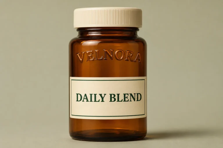
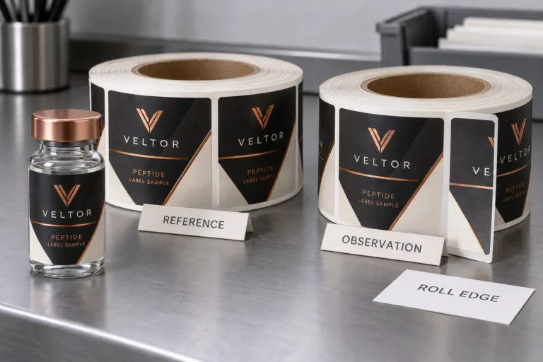
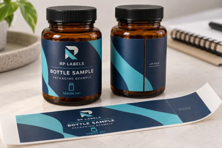
The generated images illustrate information placement and light direction. They are independent fictional packaging views, not measurements of an actual production sample. Do not use their apparent consistency as evidence of material behavior.
Change the photograph before changing the print

When the problem appears only in the image, ask the photographer to review the view, light position, reflected surroundings and crop. Keep a reference to the starting arrangement and assess whether the important information remains understandable in the intended display format.
The purpose is not to find one heroic angle that conceals an unreadable package. It is to avoid blaming the print for a problem introduced by a particular photograph. If several plausible photographs and the physical package share the same difficulty, the design question becomes more substantial.
Do not edit product wording or remove important information from a photograph to manufacture a clean result. The published image should represent the approved packaging honestly. An attractive retouch is not an alternative to resolving the package’s actual information hierarchy.
When the design itself needs review
A broad reflective region can be an intentional accent, but its relationship to the reading area should be clear. Mark the zones that need visual quiet and the zones intended to carry the effect. Review whether the product name is competing with the most active part of the design.
The holographic white-ink readability guide addresses that next artwork decision. It helps distinguish opaque information areas from exposed reflective regions. Any revised coverage or construction must still be confirmed for the actual order rather than inferred from an illustration.
Reducing decoration may be a fair option. So may moving an accent while keeping the accepted material. Ask the supplier to identify what would change, what evidence should be reviewed and whether a new release is needed. Do not assume that every visible improvement requires an additional finishing operation.
Two illustrative reviews reach different outcomes
Imagine a brand reviewing a sample whose identifier remains clear in ordinary physical viewing. Its initial product image places a strong highlight across that identifier. The first useful action is a controlled photography review. Reprinting before exploring that route may leave the same shooting problem attached to the new stock.
Now imagine a brand whose essential wording crosses an active reflective region and is uncomfortable to locate on the physical vial as it moves. A flattering listing photograph cannot resolve that package-level problem. The artwork or proposed construction needs review before approval.
These are conditional examples, not reports of improved conversion or customer tests. A fair decision also allows the existing package to remain unchanged when the actual issue is a presentation choice. The supplier should not gain an unnecessary printing order merely because the photography question was left unasked.
Keep appearance approval tied to the accepted reference
Save the accepted physical reference and a useful photographic record with the artwork revision. Label which images are appearance references and which are only marketing compositions. A different crop or exposure should not silently become the master color or construction standard for a repeat order.
If a later change affects the material, finish, artwork or vial, identify whether another review is needed. The aim is an understandable approval decision: what was examined, under which relevant conditions, and which next action follows from the observation.
Questions about reflective vial-label photographs
Does glare mean the holographic label is defective?
Not by itself. Establish whether the issue appears on the physical package or in the selected photograph, then inspect the relevant design and viewing conditions.
Can a digital mock-up approve the real reflective effect?
It can communicate a visual direction. It cannot establish the response of an actual production construction under real lighting. Use an appropriate physical reference for that decision.
Should every photo use exactly the same angle?
Use comparable conditions when isolating a difference, then review the views needed for the actual channel. One fixed angle should not replace checking the package’s intended reading task.
What should I send for a design review?
Submit the current artwork, vial dimensions, sample reference, relevant photographs and the viewing problem through the project enquiry form. Identify the words that must stay clear and the region intended to reflect. Ask what should change only after the team understands where the problem occurs.