Soft-Touch or Ordinary Matte Labels? Compare Surface Feel Without Changing the Design
A matte appearance does not tell you how the surface feels
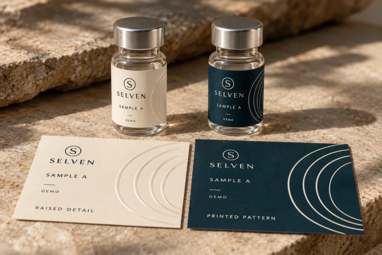
Two sample labels look similarly subdued under light. One has an ordinary matte surface; the other is described as soft-touch. If the buyer wants a particular handling experience, a photograph of the two will not settle the choice. First decide whether the desired difference belongs to appearance, surface feel or both.
I would compare identified samples with the same design and container wherever practical. Keep the visual review separate from the tactile observation and the handling requirement. A soft-touch name does not establish the full construction, durability or the actual finish RP Labels can offer for a particular order.

Describe the tactile requirement without prescribing the process
Say what the buyer wants to notice when handling the package: a smoother or more velvety surface, a particular broad-area feel, or simply subdued reflection. Do not use soft-touch as a catch-all term for every matte or premium-looking label.
Fedrigoni describes its Soft Touch label material in terms of a velvety tactile surface. That is an example from a particular manufacturer’s range. It does not prove that another matte label has the same feel or that RP Labels supplies that named product.
Ask the proposed supplier to identify its available construction and what the sample represents. The term might describe a material or an offered finishing treatment; obtain the actual proposal instead of inferring a route from an appearance reference.
Hold the comparison conditions steady
Use the same artwork scale, bottle or jar reference and reasonable viewing conditions. If one sample is dark and unprinted while the other has a large bright panel, the visual and tactile differences are mixed together. Keep exploratory impressions distinct from a controlled comparison.
Where practical, have reviewers first record appearance and then their tactile observations. Use plain descriptions and retain the specimen identity. Do not turn individual preferences into a claim about all customers, shelf performance or willingness to pay.
| Review dimension | What to compare | What remains a separate question |
|---|---|---|
| Appearance | Reflection and reading on the same design | Surface feel cannot be approved from a photo |
| Feel | Identified samples under the agreed handling | No universal preference or quality rank |
| Marking | Observed condition after relevant authorized handling | Appearance names do not establish resistance |
| Print and codes | Required information on the offered surface | A pleasing feel does not approve readability |
| Construction | Actual offered material and finish | A visual match does not prove identical layers |
| Cost and repeat | Confirmed scope and accepted reference | No automatic price premium or availability promise |
A comparison sheet is useful when it preserves the difference the buyer actually noticed. An unexplained premium tick is less useful than a note saying the identified candidate meets the agreed handling objective and which other requirements remain open.
Distinguish broad surface feel from raised detail
Soft-touch discussion concerns an overall surface impression. A raised emblem or localized texture is a different requirement. One can exist without the other, and neither is established by shaded artwork.
The tactile-versus-printed-texture guide covers the choice between a visible motif and a physical relief feature. Use it if a buyer expects a raised logo. Do not order a broad soft-feel surface and assume it includes that separate feature.
The matte-versus-gloss guide addresses the visual finish decision. A candidate can look matte while still differing in feel. Keep those two decisions visible rather than forcing them into one description.
Ask about the handling that matters
Describe how the package is packed, moved, held and displayed. If fingerprints, scuff marks, moisture or another contact matters to appearance acceptance, agree a representative review for the actual construction. This article provides no universal rubbing count, stain test or pass threshold.
Do not assume soft-touch means delicate, or that an ordinary matte finish necessarily performs better. Compare the actual offered specimens against the relevant conditions. If the available sample is unprinted, state what it cannot demonstrate about the final printed result.
Keep any overprinting or writing field separate. A broad tactile finish does not establish compatibility with the buyer’s marker, date printer or other later operation. Identify that requirement before choosing the final treated area.
Two brand tasks can favor different outcomes
Imagine an illustrative brand whose bottles are mainly judged through product photographs. The buyer wants a quiet matte appearance but has no defined tactile task. An ordinary matte candidate may meet the requirement without an additional surface feature.
Now imagine a buyer presenting physical sample packaging where the handling impression is part of the brief. A confirmed soft-feel candidate may deserve review beside a visually similar matte alternative. The decision still needs print, application and handling acceptance for the complete label.
These situations are not customer success stories. They do not establish a commercial return from adding a tactile finish. Another valid outcome is that neither candidate satisfies the agreed package requirements and a different available construction should be considered.
Questions before ordering
Can a photo prove soft-touch?
It shows appearance; tactile comparison requires identified physical samples.
Is soft-touch always better?
Choose against the actual feel, handling and construction requirement. A suitable ordinary matte option remains valid.
Should the samples use different artwork?
Keep design, scale and container comparable so visual differences do not obscure the surface question.
Confirm the treated area and repeat reference
Ask whether the proposed surface covers the whole label or selected regions. Keep any untreated information or later-printing zone marked in the artwork instructions. A vague request for a soft label should not leave the production team guessing which area carries the feature.
Retain the accepted sample and construction reference with the approved artwork. On a repeat order, confirm availability and any relevant change. A saved marketing name alone may not identify the exact offered material and finish.
For supplement bottle and jar labels, send the package reference, artwork, dimensions, quantity per design and the handling objective through the quotation form. Ask which physical samples and confirmed constructions can answer the feel question. Choose the option for a stated task, then approve the complete proposal.