Small Label Artwork: Keep Bleed, Cut Lines and Important Text in Different Places

The outside dimensions are correct, the logo is sharp, and the product name looks balanced on screen. Then a rounded corner approaches the last letter, or a narrow border makes a small cutting variation very noticeable. The problem is not necessarily the bottle measurement. It may be that the artwork treated the cut line as a place to put information.
I would ask for the intended dieline before polishing the final layout. It is easier to place text around the real shape than to force a finished design into it afterward. On a small label, a little more working space can be more valuable than another decorative frame.
Give three boundaries different jobs
The finished cut defines the label shape and size. Bleed is artwork extending beyond that boundary so that an edge-to-edge background has coverage around the intended trim. A safe area is an interior working allowance for information that should remain comfortably away from the cut.
Adobe's print-bleed guidance explains extending background artwork beyond the finished size before trimming. For a custom die-cut label, ask the supplier for the actual setup requirements. Do not copy a number from a business-card template and assume it applies to every label process.
The purpose is simple: backgrounds can extend outward, while important information stays inward. The cut line describes production geometry. It should not be confused with an ornamental border or casually included in the printed artwork. Ask how the supplier wants that technical information supplied.
Begin with the approved shape
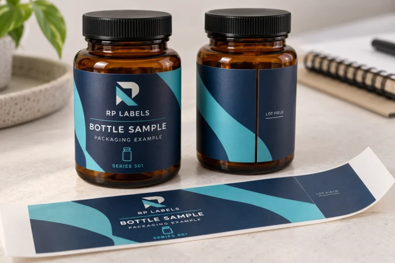
Confirm the outside dimensions, corner shape and any special contours before setting the final text. A rectangle and a rounded rectangle with the same overall width and height do not provide the same useful space near their corners. A custom contour can make this difference more pronounced.
The label size calculator can help develop a starting size for an appropriate container. It does not define a production dieline, corner radius or cutting tolerance. Once a starting size is chosen, request the supplier's artwork template or confirm the intended geometry separately.
If the shape changes later, review the artwork again. Do not assume that reducing the page size automatically moves important text to a sensible position. Check the name, date area, codes and any border against the new cut shape at actual size.
Two hypothetical designs show why the distinction matters
Imagine a small vial label with a solid blue background and a short product name. Its buyer wants clean edge-to-edge color. The designer extends the background into the agreed bleed and keeps the wording away from the corners. The layout has room to work without relying on a perfectly centered decorative frame.
Now imagine a similar label with a thin metallic-looking frame close to every edge and a long name running toward a rounded corner. Even a modest visual shift can make that frame appear uneven. The buyer may get a better result by moving or removing the border and shortening the hierarchy, rather than trying to make the physical label larger everywhere.
These are illustrative artwork situations, not measured production tolerances or reported orders. They highlight different sensitivities. A design that depends on very tight alignment needs a more specific discussion than a design with a forgiving background and a generous interior layout.
Protect the information that matters most
Place essential wording, logos and changing information in the usable interior. Assess the longest expected product name and field values. A short example may fit neatly while the actual text collides with a corner or another element. Resist solving that collision only by making every line smaller.
A code also needs its own clear area. Keep decorative lines and the intended cut away from it, then review a printed sample on the container. The existing small-vial QR guide covers code placement and practical checks in more detail. Correct bleed alone cannot establish scan usability.
For a frame or a repeated pattern, discuss which parts may approach the edge and how sensitive the design is to alignment. A subtle background pattern is often more forgiving than a high-contrast line that visually measures the margin around the whole label.
Send a file that makes the boundaries understandable
Follow the supplier's preferred file and layer instructions. Do not invent a technical layer name or printing behavior and assume every workflow will interpret it the same way. Ask whether the dieline should be a separate layer, a specified path or a separate reference file, and how it should be excluded from the printed result.
- Confirm the final shape, overall size and corner geometry with the supplier.
- Obtain the required bleed and interior allowance for that job.
- Extend appropriate backgrounds beyond the intended cut without moving important information outward.
- Review the longest wording, variable fields, codes and borders at actual size.
- Export using the agreed setup, keeping technical guides distinct from intended printed artwork.
Keep a visible reference proof showing the shape and information placement. Inspect the exported file rather than assuming all settings survived the export. Check that a technical guide has not become an unintended line in the customer-facing label.
Request help before the last-minute resize
Send the source artwork, desired dimensions, container photograph and any supplied dieline when requesting free label design help from RP Labels. Explain what must stay prominent and whether the shape is already fixed. The team can discuss a layout around those constraints rather than only shrinking a finished image.
Approve the revised artwork and representative fit before production. A good small-label layout is not the one that fills every available millimeter. It is the one that gives important information enough space to survive the transition from a screen to a cut, printed package.
Frequently asked questions
Does bleed make the finished label larger?
Bleed is extra artwork beyond the intended cut. It does not change the agreed finished label dimensions. Confirm both the final geometry and export setup with the supplier.
Is the safe area the same as the bleed area?
No. Bleed extends outward from the cut for background coverage. The safe area is an interior allowance for important information. They serve different purposes in the layout.
Can I use the same margin for every label?
Do not assume a universal value. The shape, process, layout and supplier requirements matter. Request the appropriate setup for the actual job rather than copying an unrelated template.
Should the cut line appear on the finished print?
It is normally technical information rather than customer-facing artwork. Follow the supplier's instructions for supplying and separating it, then inspect the final proof and exported file.