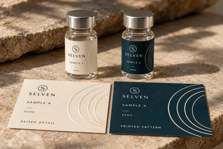
Matching Label Color on a Reorder: Keep a Printed Reference, Not Just a Color Code

The first order looked right. The next one carries the same artwork file, yet the brand panel looks slightly different beside the old stock. Before asking someone to correct the ink, I would put the two samples under the same light and check the material and finish references. “Use the same teal” is a request; it is not a complete comparison method.
Color disagreements can become expensive because different people are comparing different things. One buyer remembers a photograph. A designer has a screen preview. A warehouse colleague has a faded bottle from an earlier run. Choose the reference before choosing who is wrong.
Keep the reference that was actually approved
Retain a clearly identified physical sample from the approved construction, together with the artwork revision and order information. Record whether the sample is the appearance reference, a size mock-up or an early development option. A drawer full of attractive but unidentified swatches creates uncertainty rather than control.
Protect the reference from conditions that could alter its appearance, and note any limitations of the sample. A label left in direct light for a long period may no longer represent the original approval reliably. Ask the supplier how to preserve and identify the agreed reference for repeat orders.
The International Color Consortium explains the role of display calibration and profiling in communicating color through a managed workflow. This helps explain why an arbitrary phone display is a poor master reference. It does not mean that every screen can reproduce the appearance of every printed or reflective material exactly.
Separate a color change from a construction change
List what is being reordered: face material, background or white coverage, printing approach, finish and artwork revision. If any of these changes, treat the appearance review as a new question. A color instruction attached to one construction should not silently become a guarantee on a different one.
For example, a colored panel printed over an opaque area can look different from the same design interacting with a reflective surface. The buyer may prefer either result, but the difference should be deliberate. A change from a quiet finish to a glossy one also deserves a fresh physical comparison.
This is why I would ask for the old construction reference before asking for a different color number. Correcting artwork values to compensate for an unidentified material change can create another mismatch when the original stock returns. Fix the definition of the job first.
Two hypothetical reorders require different conversations
Imagine a buyer repeating an unchanged bottle label and keeping old and new stock on the shelf together. The priority is continuity. The supplier needs the approved physical reference and confirmation that the material, finish and artwork remain the same. A sample review should compare the two under consistent conditions.
Now imagine a brand moving from a white label to a predominantly holographic design. The buyer wants the same brand identity, but the package will interact differently with light. Here the useful question is what appearance should remain consistent and what reflective effect is intentionally changing. Insisting that every viewing angle look identical would be an unclear target.
These are illustrative situations, not records of RP Labels orders. The first concerns a repeat specification. The second concerns a design change that needs approval. Mixing the two can turn an intentional redesign into a dispute over an old reference.
Agree how samples will be viewed
Compare candidates beside the agreed reference, in the same orientation and under consistent lighting. Put them on the intended container when that changes the appearance. Avoid comparing a loose swatch in one room with a photographed bottle on a phone in another.
For reflective labels, define which areas are intended to carry stable, readable information and which areas provide the changing optical effect. Review more than one practical viewing angle. A foil accent is supposed to respond to light; the brand name still needs to do its job.
- Identify the physical reference and the artwork revision being compared.
- Confirm the proposed material, print background and finish references.
- View samples side by side under agreed, consistent conditions.
- Separate intentional reflective changes from unintended differences in information panels.
- Record who approves the appearance and retain the approved sample for the next order.
If your purchasing specification needs numerical color measurements or tolerances, agree on the method and conditions with the supplier. Do not invent a pass number after receiving the run. A photograph can communicate a concern, but automatic phone adjustments make it a weak substitute for an agreed physical comparison.
Do not use new artwork to hide an uncertain reference
A rushed file adjustment may make one sample look closer on one screen while weakening control of the next order. Keep any intentional correction as a documented revision. Explain what was changed and which sample the new artwork is intended to match.
The custom label specification guide can help keep artwork and construction information together. For a predominantly reflective design, review the holographic information-panel guide before deciding that more color saturation is the answer. A stable opaque area may serve the brand better than trying to control a reflection everywhere.
Make repeat-order approval a small, repeatable task
Send the previous order or construction reference, current artwork revision, intended container, retained sample and quantity per design. State whether the job is unchanged or describe each requested alteration. Identify which color or information area is most important commercially.
Ask RP Labels to review the repeat-order specification before production. Keep the physical reference and approval decision with the order record. The aim is to make the next comparison straightforward, rather than forcing everyone to remember how a sample looked six months ago.
Frequently asked questions
Is the same color code enough for a repeat order?
It is useful information, but it does not describe the entire printed appearance. Confirm the material, background, finish, artwork and agreed reference as part of the repeat specification.
Can I approve a match from a phone photograph?
A photo can help discuss a difference, but lighting, camera processing and display settings affect what people see. Use the agreed physical sample and viewing method for a demanding appearance approval.
Will a holographic label look identical at every angle?
No fixed appearance should be assumed for a reflective effect. Define the intended optical areas and review the practical viewing conditions, while keeping important information clear.
What should I retain after an approved order?
Keep an identified physical sample, artwork revision, construction and finish references, and the approval record. Ask how the reference should be stored so it remains useful for later comparison.