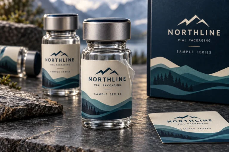
Peptide Vial Labels: Keep Multiple SKUs Clear and Consistent

A family of vial labels needs two things that can pull in opposite directions. The range should look like one brand, but the buyer and packing team should still be able to tell the variants apart. If every small label uses the same dark panel and the product name is the smallest word on it, consistency has become confusion.
My practical rule is to keep the layout stable while giving each SKU an unmistakable text identity. Color can help, but should not carry the whole distinction. This article concerns printed packaging and artwork control for peptide vial labels; it does not assess vial contents, product suitability or instructions for use.
Start with a master layout and a variant data sheet
Define the fields shared across the range: brand position, product-name area, product code, batch field and any approved information panel. Then make a separate data sheet containing the values for each SKU. The designer should be able to identify which elements are fixed and which change without reading a long message history.
Use stable column names and a unique code for every artwork version. Avoid calling two files final when they describe different products. Where the buyer is responsible for wording or market review, record the approved text rather than asking the print supplier to infer it from a reference photograph.
Our custom vial label range shows packaging design directions. Those images are references for customization, not a substitute for your approved product information. Treat the master layout and data sheet as the operational source for the order.
Give the smallest label a clear reading hierarchy
Place the product name and code where they can be found consistently. A large logo may be desirable, but it should not push the distinguishing information into a narrow seam area. Review an actual-size mock-up on the intended vial rather than making that decision on a large monitor.
Keep text away from the shoulder and curved base. Check how much of the main panel is visible from one viewing angle and where the seam falls. A useful layout lets someone read the identifier without hunting around the container. Label dimensions need to follow the actual vial, not the nominal capacity written in a catalogue.
For the dimensional starting point, see our existing vial measurement guide. Once fit is established, the question here is different: does the layout preserve the same information hierarchy for every variant, including the one with the longest name?
Use color as a second signal
A teal, blue or violet accent can help distinguish variants at a glance. Keep a visible text code as well. Lighting, reproduction and the way labels are arranged can make colors less reliable than they seem in a design presentation. You should not need to remember that the darker purple means one product and the lighter purple means another.
Test the master layout with the longest and shortest text values before filling every version. If one name requires a dramatically smaller font, reconsider the shared name area. Shrinking only that variant may preserve the grid in the proof while weakening the real package.
Keep the accepted color references and print specification for repeat orders. A digital color value helps communicate intent, but it is not a physical approval reference by itself. Discuss the level of color control needed for your range instead of assuming all materials and print processes produce identical results.
Two hypothetical orders reveal different priorities
Consider an illustrative small-brand buyer preparing three variants for a short first run. The buyer wants the range to look coordinated, but demand per SKU is uncertain. A shared layout with prominent codes can keep the design work manageable. The quotation still needs the quantity for each design; a combined total does not tell the supplier how many of each label to print.
Now consider a hypothetical distributor adding twelve variants over time. The main risk is less about inventing a new look and more about releasing the wrong data into an established layout. The buyer benefits from a revision log, a checked data sheet and one named approver. New variants should be reviewed beside existing ones, not in isolation.
There is a counterexample to excessive standardization. A much smaller vial or a different container shape may need a separate layout. Forcing the same dimensions and font treatment onto both packages can create fit and reading problems. A consistent brand family can use more than one technically appropriate template.
Decide where changing batch information belongs
Clarify whether batch or lot information is supplied in the printed order, added later by the buyer, or left as an identified writable field. Each route changes the approval and handling process. Do not present a decorative lot field in a reference design as confirmation that a particular marking method will work on the finished label.
If later overprinting or writing is planned, tell the supplier the method and ask to check the proposed surface. A finish selected for appearance may not be the right starting point for subsequent marking. Keep the fixed artwork and changing production data separate, with a clear record of who owns each.
For any operational barcode or code, supply approved data and arrange an appropriate physical check. A generated design illustration is not a working identifier. Avoid copying an example symbol into the production file because it looks convincing.
Approve the family, then approve every variant
First review the master layout against the actual container. Then compare each SKU proof with its row in the data sheet. Check product name, code, quantity split and fixed information. Finally, view the family together to catch misplaced accent colors or unexpected shifts in hierarchy.
Record a revision number for each approved file and retain the release list with the order. If one SKU changes, make the scope of that change explicit. Do not replace an entire shared folder without identifying which files are superseded. The goal is to make the supplier’s production instruction and the buyer’s approval record describe the same range.
Questions about ordering several vial label designs
Can I put several SKUs into one quantity total?
Send both the total and the split per design. RP Labels can start from 100 pcs subject to each design and specification being confirmed. Ask how your proposed variant quantities affect the quotation rather than assuming the combined total determines every minimum.
Is color enough to distinguish the variants?
Use a readable product name or code as the primary identifier, with color as an additional cue. Confirm that each design remains distinguishable on the actual small container and under ordinary viewing conditions.
Should every vial size use exactly the same layout?
Keep the brand system consistent, but adapt the technical layout when dimensions differ. Verify the available reading area, seam and text size on each container rather than forcing one template to fit all packages.
Who checks the wording and lot information?
The buyer should provide and approve the product information and specify who supplies changing data. The printer can help organize artwork, but should not invent content or replace the buyer’s product review.
Make the next variant easier to release
Request a multi-SKU vial label quote with your vial dimensions, artwork or logo, variant data sheet, quantity per design and delivery country. RP Labels offers free artwork and digital proof support. A well-controlled master layout saves more than design time: it gives the next person opening the folder a clear answer about which file belongs on which vial.