Holographic Labels That Stay Readable: Plan the White Ink Before Printing

A holographic label attracts attention when the bottle turns. That same reflection can compete with the product name, small batch details or a code. A buyer may love the flat artwork and then find the important information harder to read under a bright desk lamp.
I would not solve that by making every part of the design shinier. The better purchasing brief separates the areas that should reflect from the areas that should stay visually stable. White ink is one way to create that separation. Plan it while approving the artwork, not after the first printed sample surprises you.
Give the rainbow a specific job
Decide what the reflective effect is supposed to accomplish. It might frame the product name, distinguish one range or add a narrow premium accent. A small vial does not have unlimited room, so the optical effect should support the information hierarchy rather than occupy every available space.
Mark the product name, identifying information and any scan area as essential reading zones. Then choose where a border, motif or background can carry the reflective appearance. This turns a broad request for holographic labels into a layout that a supplier can discuss and sample.
The design still needs color and a recognizable brand mark. An opaque panel does not mean a blank white label. It can contain complete printed artwork while the surrounding reflective areas provide the material character you wanted.
Understand what a white layer changes
On a reflective base, printed colors can interact with the surface beneath them. Selective white ink creates more opaque areas, helping separate information from that background. The appearance depends on the proposed material, print and finish, so ask how the supplier will construct the actual label.
StickerApp’s material guidance notes that reflective bases can affect color and that white ink helps control opacity and readability. That is useful background, not a specification for an RP Labels order. Obtain a sample and the file instructions for the construction you are buying.
Avoid assuming that a white-looking area in a screen file automatically requests white ink. Depending on the production workflow, it may mean an unprinted area or require a separate white layer. Confirm the interpretation explicitly so both parties are approving the same effect.
Map three areas in the artwork brief
First, identify the opaque information area. Give it enough room for the approved text without squeezing everything into tiny type. Second, identify reflective accents that may change appearance with viewing angle. Third, identify transition areas where color sits directly over the reflective base.
Ask the supplier to show those decisions clearly in the proof discussion. The color artwork and white layer should correspond to the same version. If the designer moves a panel, both parts need to be reviewed together; the white layer should not remain tied to an earlier layout.
Use a clear instruction such as “keep this product-name panel opaque; leave this outer border reflective.” It is more useful than “make the whole label premium.” If you do not have a production-ready file, send the concept and ask for the required preparation rather than inventing a spot-color convention.
Review the bottle, not only the flat rectangle
A narrow cylindrical container changes how much of the label faces the viewer at once. Put the main name in the front-facing area and examine where the information panel moves as the bottle turns. A large flat preview can conceal a layout that feels crowded after wrapping.
Check the proposed size against the usable container area. Our label size calculator gives a starting estimate; a paper mock-up and physical sample still need to confirm the fit. Keep essential text clear of the seam and unsuitable shoulder or base curves.
Review the sample under more than one sensible lighting condition. Soft diffuse light helps assess the layout. Directional light reveals how reflection affects reading. The question is not whether the label stays identical at every angle; it is whether the information remains accessible during ordinary handling.
Two hypothetical layouts show the tradeoff
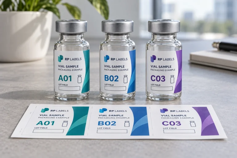
Imagine a hypothetical packaging buyer choosing a small research-vial label. The first draft places every text line directly on the reflective base. It has a strong optical effect, but the product name competes with the rainbow. A revised draft gives the name an opaque panel and keeps a reflective frame and original scientific motif around it.
Now imagine an illustrative promotional seal with only a large logo and one short line. It may have more freedom to show the material across the whole surface. The information load is lower and the viewing context differs. That does not make the seal’s layout a suitable template for the vial.
The counterexample is a buyer wanting an intentionally reflective brand graphic with no dense information panel. An extensive white layer could suppress the chosen effect. The right answer is selective control, not an instruction to cover every holographic label in white ink.
Agree what the proof can actually establish
A digital proof is useful for dimensions, spelling, layout and the intended separation of layers. It cannot reproduce every optical response of reflective material on a screen. Ask which parts of the appearance need a printed sample before production approval.
Review the actual material and finishing proposal with the artwork. Keep an accepted sample reference when the visual result matters to repeat orders. Do not treat a photograph, a generated mock-up or an animation as proof of the printed material’s response.
Our free label designer can help you develop an initial direction. For finer typography, original brand artwork or a more carefully planned white layer, contact RP Labels for free professional design assistance. The first concept should make the discussion easier, not replace the final production review.
Budget for the effect you need
Request a quote that identifies the reflective construction, white ink arrangement, finishing and quantities per design. Ask what changes if the white coverage or finished size changes. Do not compare an unspecified reflective sticker with a carefully prepared label as if they were the same production brief.
Reducing decorative complexity may be a better tradeoff than shrinking important text. If you need a scan area or variable information field, allow space before committing to an optical border. The purchasing priority is readable packaging with a deliberate effect, not the maximum amount of shine.
Questions about white ink and holographic labels
Does white ink remove the holographic effect?
It can reduce or mask the effect where it is printed. Selective coverage lets you keep reflective areas elsewhere. Confirm the intended coverage and appearance on the proposed construction.
Can a PDF prove the final rainbow effect?
No. It can show layout and layer intent, but the material responds to real light and viewing angle. Use a relevant printed sample when that response is important to approval.
Should small text sit directly on the reflective base?
Do not assume it will remain comfortable to read. Review size, contrast and the actual printed result. An opaque information zone may be a better choice for essential text.
Can RP Labels help prepare the artwork?
Yes. Ask for free design assistance and explain the opaque and reflective areas you want. Confirm the production file and digital proof before releasing the order.
Start with a clear reflective-label brief
Send RP Labels your holographic label enquiry with the container, dimensions, quantity and artwork direction. Identify the information that must stay readable and the accents that should reflect. That gives the design team a practical starting point for a label customers can both notice and understand.